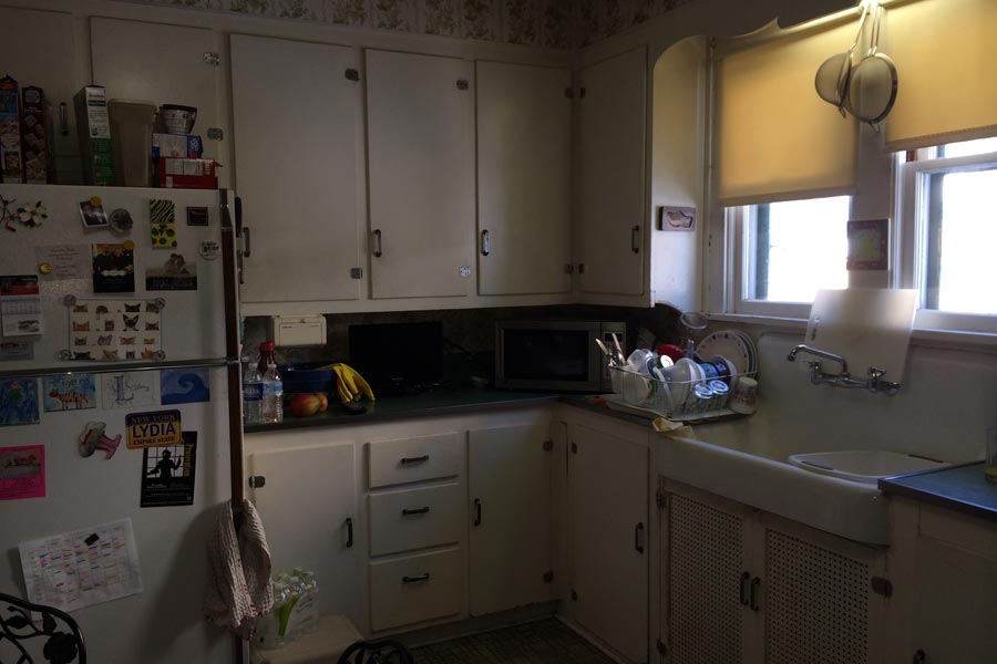
Since 1987, Renee Hostetler and Mark Huibregtse have lived in a Saratoga Springs Dutch colonial built in 1929, the first year of the Great Depression. That pretty much describes the feelings the home’s outdated, original kitchen inspired in them.
“In past years, I’ve gone to the Showcase of Homes, and I’d be all depressed coming back to my 1920’s kitchen,” Renee said. When Renee’s mother passed away and left her an inheritance, Renee knew exactly how some of it should be used.
“I like to think she would have been so happy, because she was always bugging us: ‘When are you going to do something about that kitchen?’” Renee said.
Renee had long admired the kitchen of Elizabeth Tanny, whom she knew through her work with Kindermusik. Tanny is the principal designer at E Tanny Design LLC.
Renee heard about Teakwood Builders through another friend, Jen Perry, who had recently had a spectacular makeover of her own kitchen.
“I didn’t have any kind of vision at all. I knew I loved what Elizabeth had done with her own kitchen, and I knew the work needed to be done well,” Renee said. “That I get from my mother. She taught me the value of high-quality workmanship and materials.”
“One of the wonderful things about choosing Teakwood is that there was never any feeling that there was an issue with the fact that I wanted to use an outside designer,” Renee added. Teakwood’s designer, Eva Andersen, worked with Tanny to facilitate communications with Team Teak.
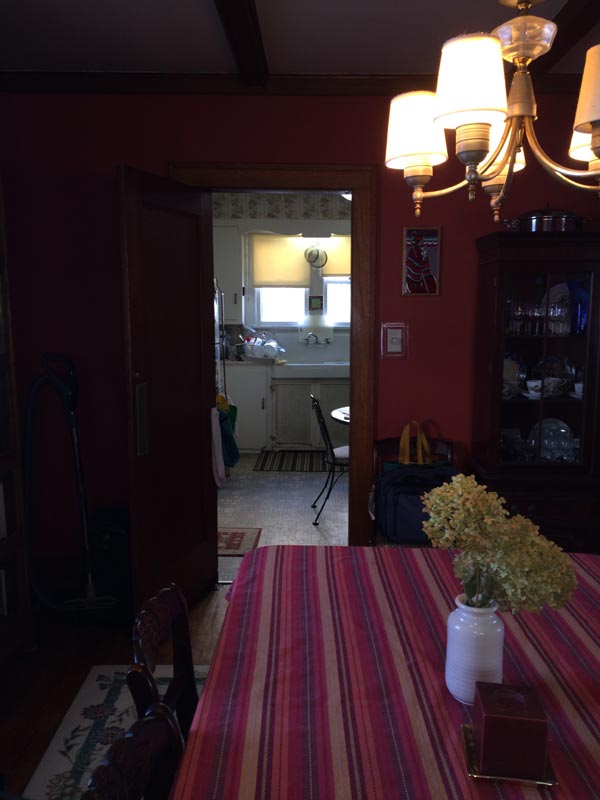
The plan involved removing the wall between the kitchen and dining room and adding a single-story addition to create a den, mudroom and downstairs bathroom. The design included modern amenities such as central air-conditioning and a built-in sound system, but went to great lengths to preserve and match the architectural details that gave the house its character.
In February 2015, Renee, Mark, and their daughter, Lydia, hauled a microwave into the living room and turned a bookcase into a makeshift pantry. Teakwood boarded off the construction area, and the family coexisted with the work crew until the project was finished in July.
“After a brief period of adjustment, it was relatively easy,” Mark said. “We were here for the whole time except for one week when they did the floors.”
“It wasn’t something I knew before I hired Teakwood, and it wasn’t the reason I hired them,” Renee added. “But one of the things I learned was just how personal, personable and hands on Teakwood is, and how they follow through. I don’t know. I feel like I have friends for life.”
Coffers were installed on the new kitchen ceiling to complement original coffers on the living room ceiling. The original oak floors were matched with such care it is now hard to tell the old from the new. Windows were redone to eliminate drafts, and a design engineer made sure the addition left an angled driveway so that the family could still get both cars into the garage.
One thing that struck the couple was Teakwood’s attention to detail.
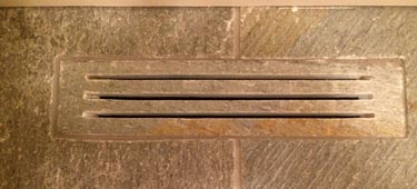
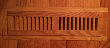
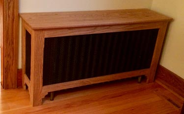
At the point when a Teakwood craftsman was making custom covers for the old radiators, lead carpenter Joel Sasko suggested the couple have custom vents cut from matching materials to sit flush with the natural slate and oak floors. Renee and Mark considered it, but decided not to add to their budgeted amount.
“I did not want the metal grates installed and thought the wood and stone was a much better look,” Sasko said. “I ended up buying the vents as a gift, knowing that she would be much happier with that look. Renee and Mark are awesome clients who truly appreciated the work we did to their house.”
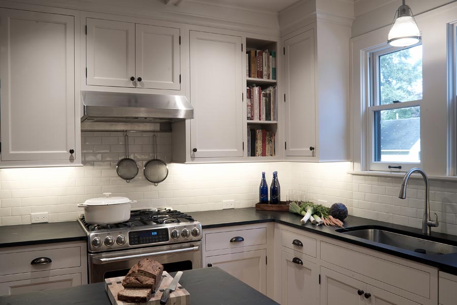
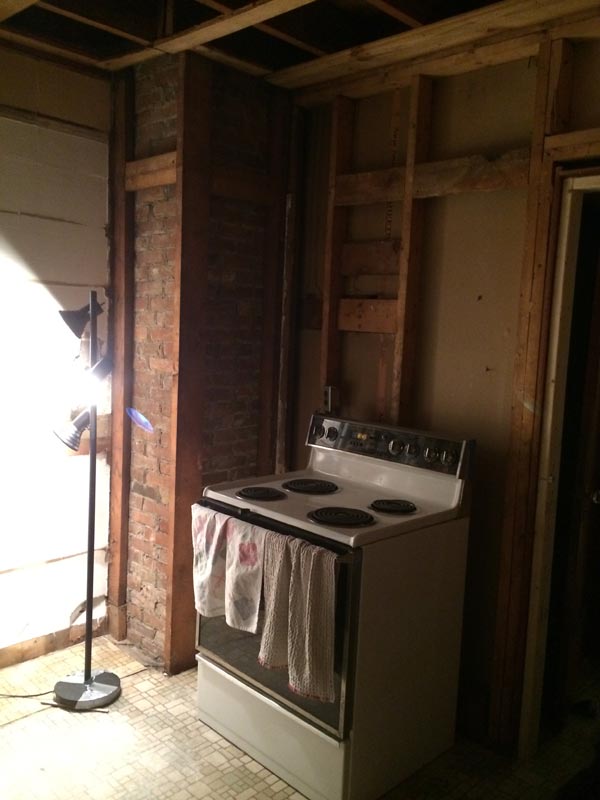
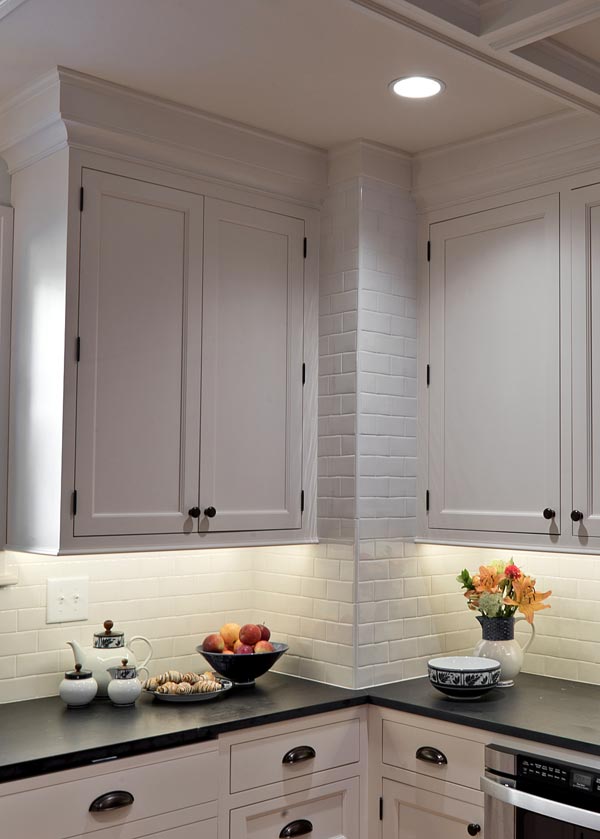
One of Renee’s favorite visuals in the kitchen design is the way the glossy white subway tile goes all the way to the ceiling instead of just around the backsplash. This inspired adjustment to the original plan happened after demolition uncovered a red brick chimney.
Project Planner Thad Smith came up with the idea of taking the tile straight up the chimney, using the sides of the chimney to anchor cabinetry and counters.
“Another one of my favorite things is, I love the island,” Renee said. “I never had one before and both Eva and Elizabeth said I would constantly be turning around to use it. They were right.”
The contrast between the honey walnut of the slate-topped island and the antique white perimeter cabinets bring depth to the room. The island also has deep drawers for pots and pans. The microwave drawer glides out with a push button under the opposite counter.
The range was moved to an outside wall facing the driveway, and every Saturday morning when Renee gets back from teaching, she is warmed by the smell of Mark’s weekend baking.
Renee went to the Showcase of Homes again this year.
“This year when I came home, I liked my kitchen as well as, if not better, than anything I saw there.”

